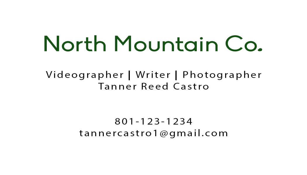
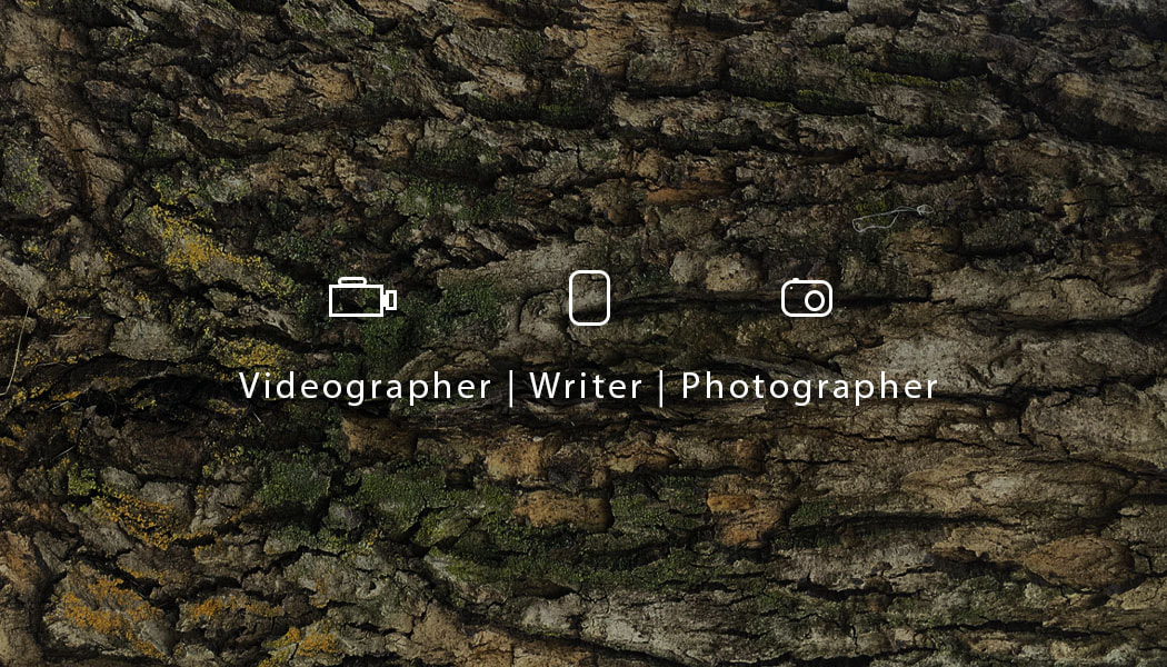
Business Card
Description of skills:
I wanted to create a business card for myself for things that I do for fun. The image of the bark is of a tree from an old college house that I lived at in Logan. I rotated the image and then changed the exposure and changed the hue/saturation to make it more green becuase the color green reminds me of the mountains. Even spacing for both sides of the card as well as centering the text so its in the middle of the card. Multiple fonts used to create a theme of flow but also to differentiate important aspects of text. I chose the fonts that I did becuase I liked how they looked and thought that they gave the aesthetic I was looking for my card. The color that I used was the green hue change that I did with editing the picture and changing the font color to a forest green for the title of my Company name. For the Videocamera, camera and paper I used shapes to make those and then once I got them to the sizes I wanted I exported them as jpegs images and then centered them over the titles of what I do in my business as well as making sure there was even spacing in between it all.
Exposure Adjustments: Brightness -50, Contrast +50
Hue/Saturation Adjustments : Green
Center Alignment
Proximity
Fonts used : Myriad Pro
Shapes